Introduction
When was the last time a business card actually made you smile?
Not the polite, reflexive smile—but a genuine one. The kind that lingers for a second longer than expected. The kind that makes you think, “Wow, this person gets it.”
That’s the quiet power of a happy business card.
In a world obsessed with digital-first everything—LinkedIn connections, QR codes, email signatures—it might seem strange to pour this much thought into a tiny rectangle of paper. Yet that’s exactly why it works. When almost everything feels transactional, a well-designed, emotionally resonant business card feels human. Memorable. Refreshing.
A happy business card isn’t about childish colors or forced cheerfulness. It’s about intention. It’s about how design, language, texture, and tone work together to leave someone feeling positive about you and your brand—often before you’ve even had a full conversation.
In this guide, we’re going deep. You’ll learn what a happy business card really is, why it matters more than most people think, how to design one step by step, which tools actually help, and what mistakes quietly ruin the effect. Whether you’re a freelancer, startup founder, creative professional, or small business owner, this article will help you turn a simple card into a powerful brand moment.
And yes—by the end, you’ll never look at business cards the same way again.
What Is a Happy Business Card, Really?
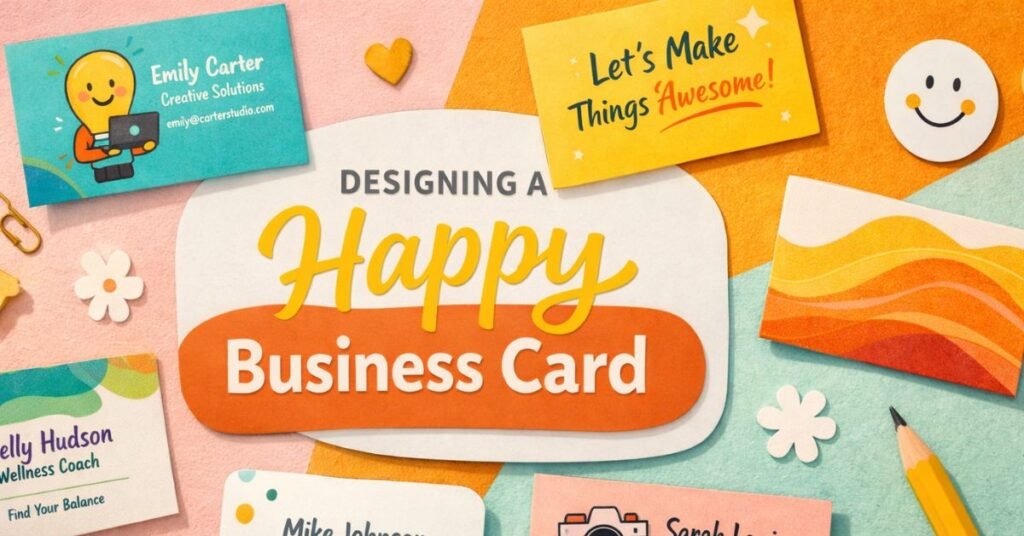
A happy business card isn’t defined by a smiley face, bright yellow paper, or playful fonts—though those can be part of it. At its core, a happy business card is one that creates a positive emotional response the moment it’s seen, touched, or read.
Think of it like this: most business cards are neutral at best. They inform, but they don’t feel. A happy business card, on the other hand, communicates warmth, confidence, and approachability without trying too hard.
It works on the same psychological principle as a good handshake. Not limp. Not crushing. Just right. It signals, “You can trust me. I’m easy to work with. I care about details.”
Here’s what usually sets a happy business card apart:
- Color choices that feel optimistic, calm, or energizing
- Typography that’s readable yet full of personality
- Copy that sounds human, not corporate
- A layout that breathes instead of cramming information
- Small surprises—texture, illustration, whitespace, or wit
Imagine two cards side by side. One says:
“John Smith
Senior Solutions Consultant
john.smith@email.com”
The other says:
“John Smith
I help businesses untangle messy ideas
john@johnsmith.co”
Same person. Same role. Completely different emotional impact.
That’s the difference. A happy business card doesn’t just tell people who you are—it shows them how it feels to work with you.
Why a Happy Business Card Matters More Than Ever
It’s tempting to think business cards are outdated. After all, you can connect instantly online, scan a QR code, or send a contact card in seconds. But that convenience is exactly why physical cards—especially happy ones—have regained quiet power.
Digital interactions are efficient. Physical ones are emotional.
A happy business card gives you something digital touchpoints can’t: a tangible moment of connection. When someone receives your card, they don’t just read it. They touch it. They notice its weight. They register its colors. Their brain forms a micro-memory—and emotions anchor memories far better than facts.
From a branding perspective, this matters enormously. People rarely remember job titles. They remember impressions.
There’s also a trust factor at play. A thoughtfully designed card signals professionalism without stiffness. It says you invested time into how you present yourself. That investment subconsciously translates into perceived quality of work.
Happy business cards are especially powerful in:
- Networking events where everyone blends together
- Creative industries where personality is part of the product
- Service-based businesses built on relationships
- Small brands competing with larger, louder players
And let’s be honest—most business cards are forgettable. They end up in drawers, wallets, or recycling bins. A happy business card earns a different fate. It gets kept. Sometimes displayed. Occasionally talked about.
That’s not nostalgia. That’s strategy.
The Psychology Behind Happy Design Choices
To design a happy business card effectively, it helps to understand why certain elements work. Happiness in design isn’t random—it’s deeply rooted in human psychology.
Color is the most obvious place to start. Warm tones like soft yellows, corals, and muted oranges often evoke optimism and friendliness. Blues can feel calm and trustworthy. Greens suggest growth and balance. The key isn’t brightness—it’s harmony. Overly saturated colors can overwhelm, while balanced palettes feel confident and intentional.
Typography plays an equally important role. Rounded typefaces tend to feel more approachable, while sharp, angular fonts feel formal or technical. That doesn’t mean you can’t use clean, modern fonts—just pair them thoughtfully. A friendly headline font combined with a neutral body font often strikes the perfect balance.
Then there’s spacing. Crowded cards create stress, even if people can’t articulate why. Whitespace, on the other hand, signals clarity and calm. It tells the reader you’re not desperate for attention—you’re confident enough to let things breathe.
Language matters too. Humans respond better to conversational phrasing than corporate jargon. “Let’s build something great” feels warmer than “Providing integrated solutions.” The first invites connection. The second creates distance.
Even texture affects mood. Soft-touch finishes, uncoated stock, or subtle embossing create a sensory experience that feels premium and thoughtful. Your brain associates that tactile pleasure with the person handing you the card.
All of these elements work together to answer one silent question in the recipient’s mind: How does this person make me feel?
A happy business card answers: Good. Curious. Comfortable.
Benefits and Real-World Use Cases
The benefits of a happy business card go far beyond aesthetics. When done well, it becomes a quiet but powerful business tool.
First, there’s memorability. In rooms full of similar pitches and identical LinkedIn URLs, emotional design stands out. People may forget names—but they remember how something made them feel.
Second, it humanizes your brand. This is especially important for freelancers, consultants, coaches, and creatives. Your personality is part of your offering. A happy business card reinforces that before a project even begins.
Third, it opens conversations. Cards with clever copy, unexpected layouts, or playful details often invite comments. “I love your card” is an easy entry point into deeper discussion.
Real-world examples make this clearer:
- A yoga instructor uses soft colors, gentle language, and textured paper to reflect calm and balance. Clients feel aligned before the first session.
- A startup founder includes a short, optimistic brand statement instead of a job title. Investors remember the vision, not the label.
- A wedding photographer uses warm imagery and friendly typography, instantly signaling emotional storytelling rather than technical coverage.
Happy business cards are especially effective when:
- Your work involves trust or emotion
- You want to appear approachable, not intimidating
- You’re building a personal brand
- You meet people face-to-face regularly
In short, if relationships matter to your business—and they almost always do—a happy business card is a surprisingly effective ally.
How to Design a Happy Business Card Step by Step
Designing a happy business card isn’t about following trends blindly. It’s about making intentional choices that reflect who you are and how you want others to feel. Here’s a practical, start-to-finish approach that works in the real world.
Step 1: Clarify the Feeling You Want to Leave Behind
Before opening any design tool, ask yourself one simple question: What do I want someone to feel after receiving my card?
Relaxed? Inspired? Energized? Reassured?
Write that word down. It becomes your filter. Every design decision should support that feeling. If it doesn’t, it doesn’t belong.
Step 2: Simplify the Information
One of the biggest happiness-killers in card design is clutter. You don’t need everything.
Focus on:
- Your name
- What you actually do (in human language)
- One primary contact method
Social links, multiple phone numbers, and long titles often dilute impact. Less information creates more clarity—and clarity feels good.
Step 3: Choose a Friendly Color Palette
Pick one main color, one supporting color, and one neutral. That’s usually enough. Test them together. If they feel calm, cohesive, and legible, you’re on the right track.
Avoid trends unless they genuinely align with your brand. Timeless happiness beats temporary novelty.
Step 4: Use Typography With Personality
Select fonts that are easy to read but not soulless. Pay attention to letter spacing and line height—small adjustments here dramatically improve how the card feels.
Step 5: Add One Memorable Detail
This could be:
- A short, warm tagline
- A subtle illustration
- A tactile finish
- A surprising but relevant phrase
One detail is enough. Too many turn charm into chaos.
Step 6: Print With Care
Paper choice matters more than most people realize. If budget allows, opt for thicker stock or soft-touch finishes. Even simple designs feel elevated with the right material.
A happy business card isn’t rushed. It’s considered. And people can feel that.
Tools, Platforms, and Smart Recommendations
You don’t need to be a professional designer to create a happy business card—but the tools you choose can either help or hold you back.
Online design platforms have made card creation more accessible than ever. Tools like Canva are popular because they offer templates, easy customization, and built-in print options. They’re ideal for beginners or those who want speed without sacrificing polish.
For higher customization, platforms like Adobe Express give more control over typography and layout while still remaining user-friendly.
Printing services matter just as much. Vistaprint is widely used and affordable, while boutique printers often offer better paper and finishes for brands that want a premium feel.
Free tools are great for experimentation. Paid options usually shine when you care deeply about materials, color accuracy, and finishing details.
The smartest approach? Prototype digitally, print a small batch, test reactions, then refine. A happy business card improves through real-world feedback—not just screen previews.
Common Mistakes That Ruin the Effect (and How to Fix Them)
Even well-intentioned cards can miss the mark. The most common mistakes usually come from trying too hard—or not hard enough.
One frequent error is overloading the card with information. When everything is emphasized, nothing stands out. Fix this by prioritizing what actually matters in a first interaction.
Another mistake is confusing “happy” with “loud.” Bright colors, novelty fonts, and gimmicks can backfire if they don’t align with your brand. Happiness should feel natural, not forced.
Inconsistent branding is another silent killer. If your card feels playful but your website feels cold, trust erodes. Make sure your card matches the broader brand experience.
Lastly, poor print quality undermines even the best design. Thin paper, faded colors, or misaligned cuts send the wrong message. If budget is tight, simplify the design rather than compromising production.
Avoid these pitfalls, and your card will do its job quietly and effectively.
Conclusion
A happy business card isn’t about trends, tricks, or surface-level cheer. It’s about respect—for your audience, your brand, and the moment of human connection happening right in front of you.
In a small, tangible way, it says: I care how this feels.
That care translates into trust. Trust opens conversations. Conversations build relationships. And relationships are still the backbone of good business—no matter how digital the world becomes.
If you’re redesigning your card, take your time. Be intentional. Test it. Notice reactions. A single, well-crafted card can open doors you didn’t expect.
And if you already have a card? Take another look. Does it feel happy to you? If not, that might be the quiet sign it’s time for an upgrade.
FAQs
What makes a business card “happy”?
A happy business card creates a positive emotional response through thoughtful design, friendly language, balanced colors, and intentional simplicity.
Are happy business cards professional?
Yes. In fact, they often feel more professional because they signal confidence, clarity, and emotional intelligence.
Can a happy business card work for corporate roles?
Absolutely. Happiness doesn’t mean casual—it means human. Subtle warmth works in nearly every industry.
Should I use bright colors to make my card happy?
Not necessarily. Muted, well-balanced colors often feel more sophisticated and emotionally appealing.
Is a tagline important on a happy business card?
A short, human tagline can add warmth and clarity, but it should never replace essential contact information.